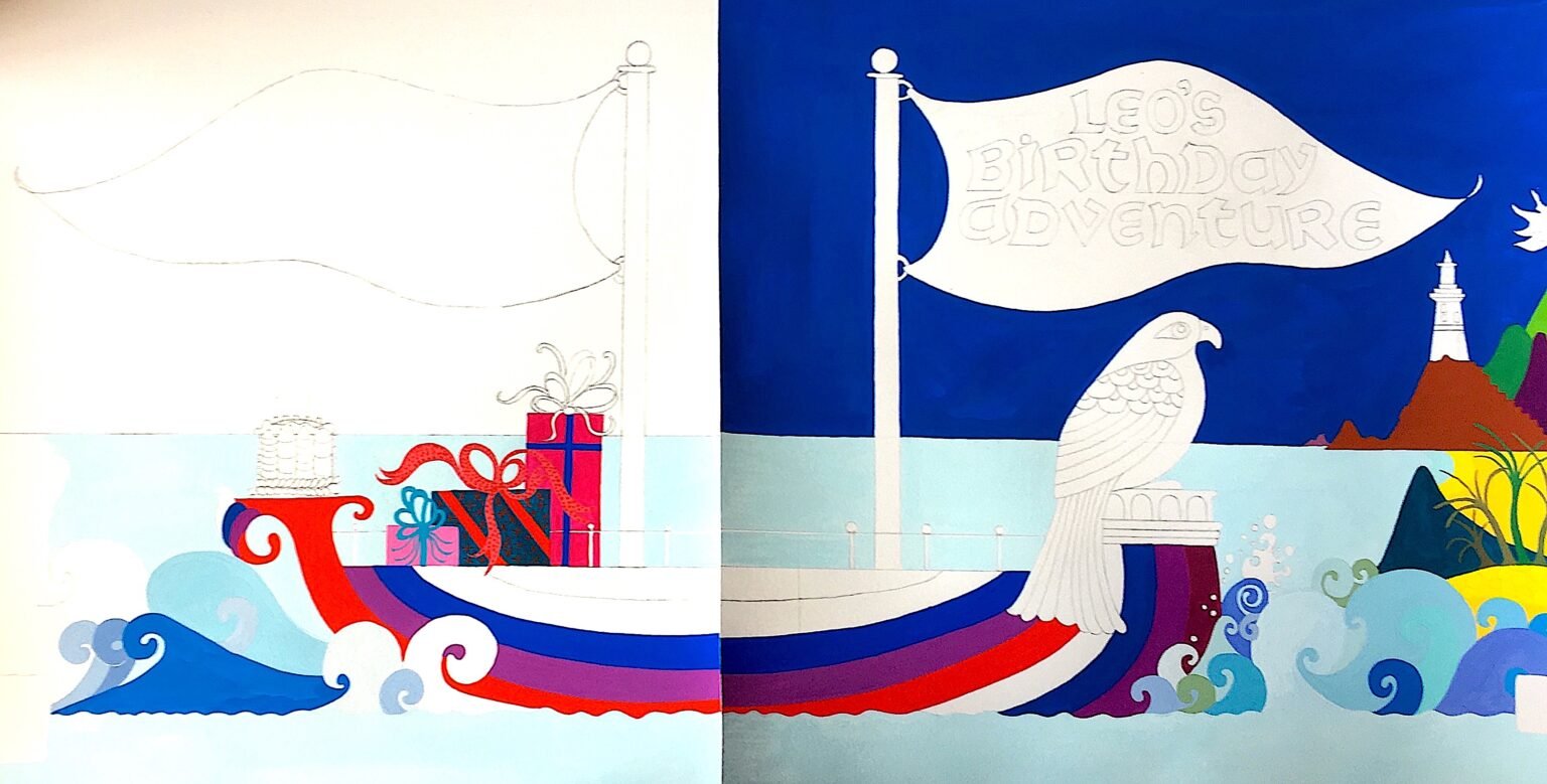
Leo’s Birthday Adventure Cover Design
Designing the cover of our children's book "Leo's Birthday Adventure" was a design adventure of its own. We first chose Jean's illustration of lighthouses and sailing ship and then added a painted cut-out of Leo the Falcon to best represent the story.
We added a Prussian blue background and worked on the title design. Jean drew her own font, but there were issues about where the title would go and what colours would complement the illustration's original colour scheme.
Jean painted various coloured titles in a different font and we placed them to the right of the page. However, we preferred the title centred and it was beginning to look a bit too much like a collage and not a cover.
Due to the many issues, Jean decided to paint the cover so that all the elements could be cohesive, with the title as part of the painting situated in the ship's sail. This meant that Jean could also paint the back cover of the book so it would all look like one illustration.
This was Jean’s finished version, however, it felt like there was something missing. The illustration didn't quite fully portray the spirit of adventure and we realised that it was missing movement.
So, Jean decided to repaint the cover (here work-in-progress). This version had the ship sailing the high seas as Leo, with spread out wings, captained the ship.
Here is Jean's final painting of the cover of “Leo’s Birthday Adventure” - colourful and joyous!
"You can read more about the book design for Leo's Birthday Adventure here."
For more about Jean's artwork visit www.jeantoriartwork.com


